Rightwealth Advisors
Summary
A local Dayton Registered Investment Advisor firm, or RIA, was in need of a new brand name, brand identity, website design, IT support management, and fractional CTO/CISO. The new brand would establish both market and technology independence as they separated from their custodian and began expanding on their team and already established success.
After a thorough research and discovery of potential names in collaboration with the wealth management team, it was unanimously decided that Rightwealth Advisors was the perfect choice for the rebrand. As an added bonus, the financial firm is conveniently located near the hometown of the famous Wright Brothers.
Brand Identity
1.1
Grounded with a modern serif that strikes a balance between bold and light, warm curves and sharp details — the Rightwealth logotype presents a strong, but approachable statement.
There were several elements at play with the final logomark. Direction from the name, the compass metaphor often associated with financial advisors, and the geographical relevance to being in the Wright Brothers backyard were all taken into consideration. In the end, a simple arrow shape with angles complimenting the angles in the letterforms encompassed all three ideas to finish off the design.


The overall brand would be dominated by mainly two colors of blue, but supported by a handful of secondary colors to compliment when applicable.


Taking advantage of the logomark’s geometric shape, we were able to establish various patterns for use in backgrounds and other marketing materials.
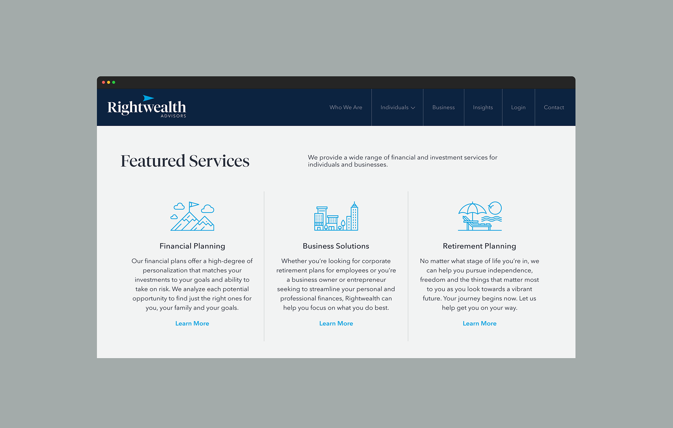
Custom icons were developed in order to provide supplemental visual aids to Rightwealth’s services throughout their digital and print materials.
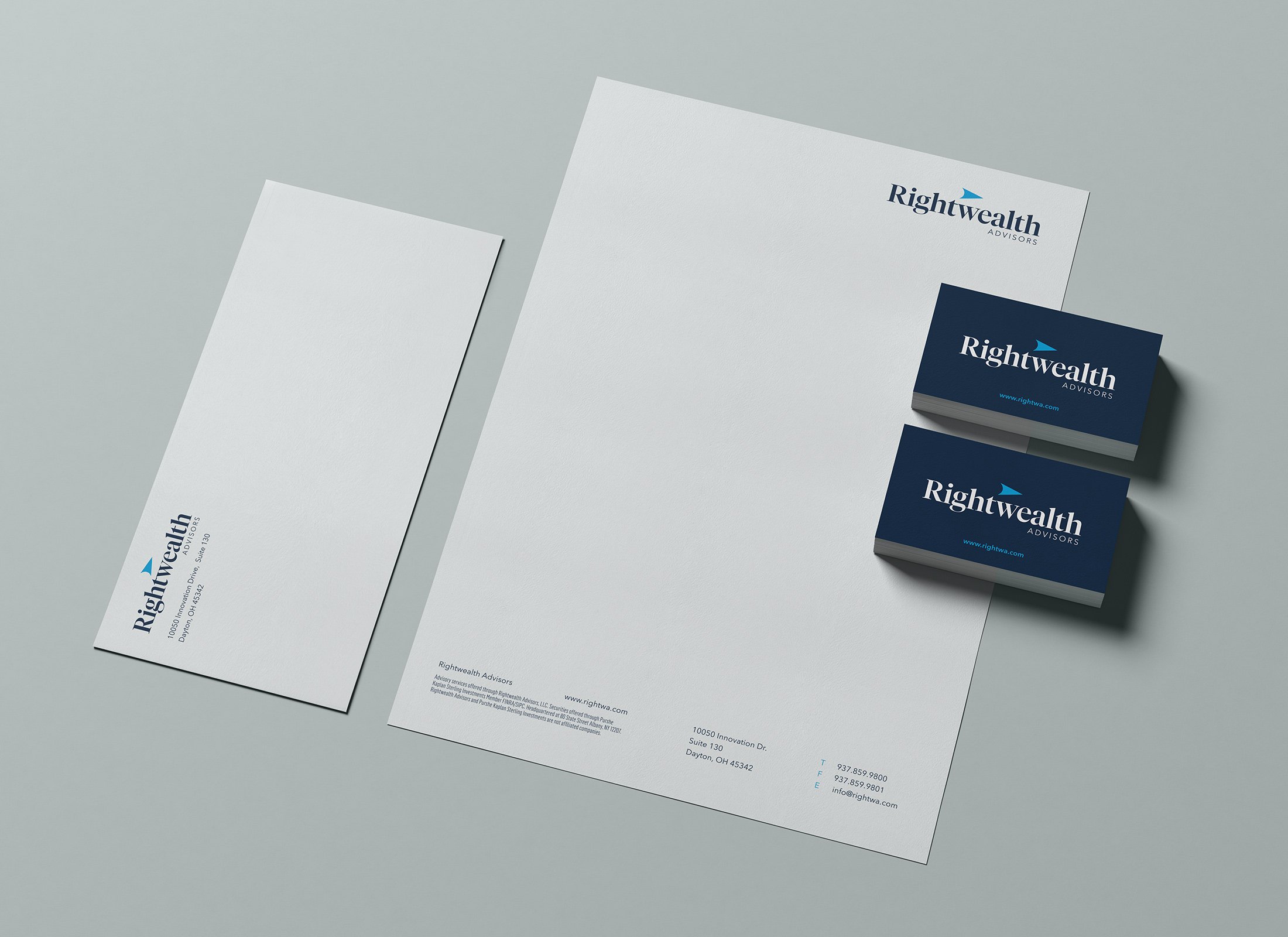
Brand In Use
1.2

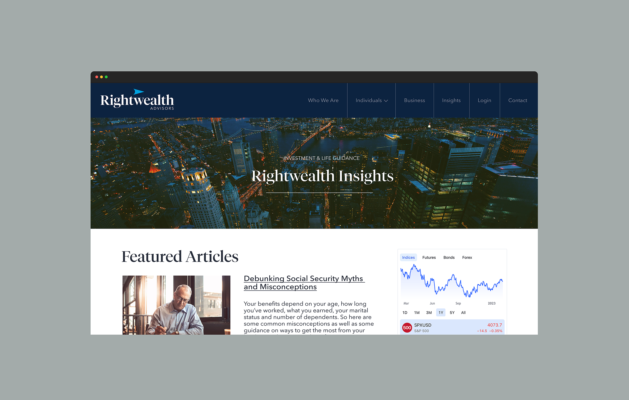
Web Design
1.3


Related